loading spinner

Theme Settings

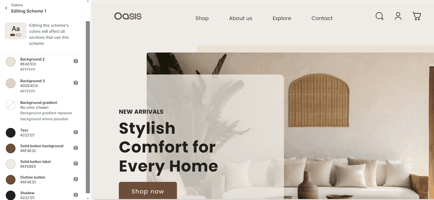
Colors

You can change the colors used throughout your website by clicking on the left-side circles in the Colors category of Theme Settings. When choosing colors, be sure to follow accessibility guidelines.

  • Background: default page background color
  • Background 2: secondary background color used in sections
  • Background 3: tertiary background color used in sections
  • Background gradient: background gradient replaces background where possible.
  • Text: The default text color is applied to all texts, including headings and text links
  • Solid button background: The default background color for primary buttons.
  • Solid button label: The default text color for primary buttons.
  • Outline button: The default outline color for secondary buttons.
  • Shadow: The default shadow color.
Color Scheme

The Oasis theme offers three distinct color schemes for text and backgrounds: Scheme 1, Scheme 2, and Scheme 3. Scheme 1 is applied across all sections, while Scheme 2 is specifically used for sale badges and sold-out badges.

Typography

To modify the Typography, navigate to Theme settings > Typography, where you have the option to change the font family for headings and body texts

Font family

To change the font families of the Heading font and Body font, respectively, click on the Change buttons in each section. The styling of headings and body texts will then follow the default styling of the chosen font families.

Badges

Here you can customize the colors and position of the sale and sold out badges

  • Position on card: choose the position the badges will be displayed at on cards.
  • Corner radius: customize the corner radius of the badge
  • Sale badge color scheme: set the color scheme for Sale badge
  • Sold out badge color scheme: set the color scheme for Sold out badge

Pages

Collection List Page

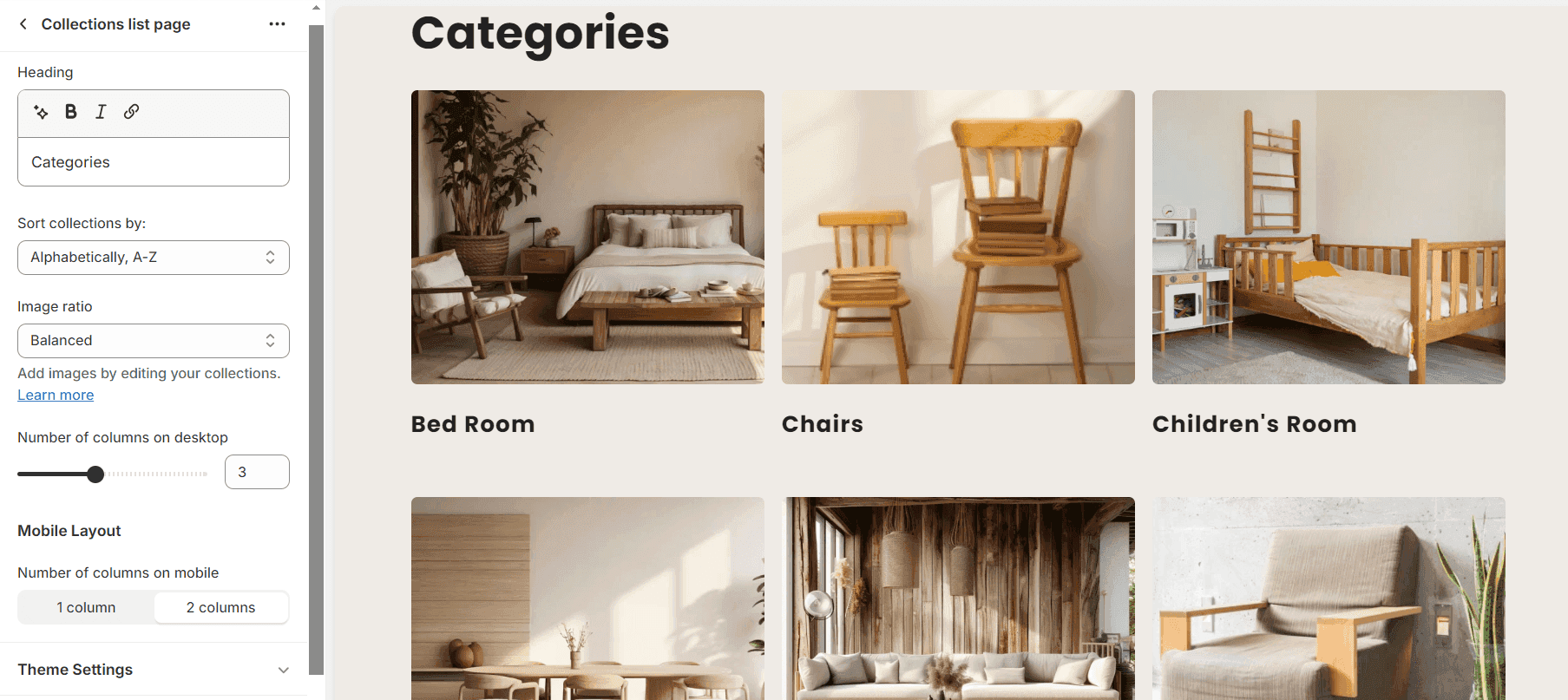
Oasis theme offers three distinct collection image aspect ratios:

  • Square
  • Portrait
  • Balanced
  • Adapt to image

You can also customize how your collections are displayed by choosing the sorting method and setting the number of columns for different devices.

Sorting Options:
  • Alphabetically: Arrange products from A to Z or Z to A. -** Product Count**: Sort collections based on the number of products they contain, either from low to high or high to low.
  • Date: Display collections by their creation or update date, showing either the newest or oldest collections first
Collection List Page
Collection Page

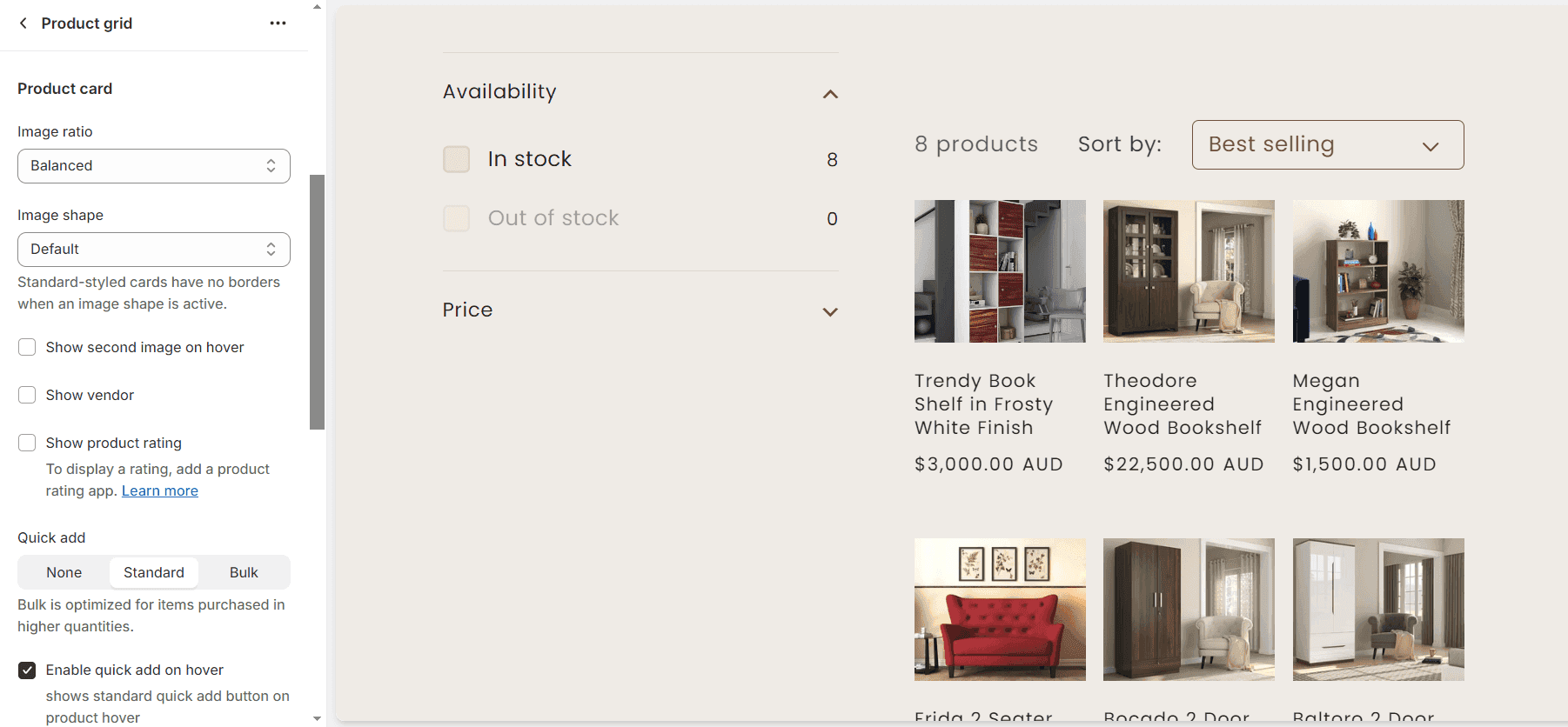
Oasis theme offers four different product image ratios to accommodate your preferences:

  • Square
  • Portrait
  • Balanced
  • Adapt to image

You can also enable or disable various display options, such as:

  • Show second image on hover: When you hover over the product image, a second image will appear. If the product does not have a second image, the product image will be zoomed out.
  • Show vendor: Display the vendor name of the product.
  • Show product rating: Display the product rating, if available. To display a rating, you must first add a product rating app.
  • Enable quick add on hover: Display add to cart button on hover
Product Page

The Product page is one of the key pages in any online store. This page provides customers with detailed information about the product and introduces them to other items they may find appealing. Most crucially, it's the primary location where purchases occur, making an optimized Product page vital for the success of any Shopify store.

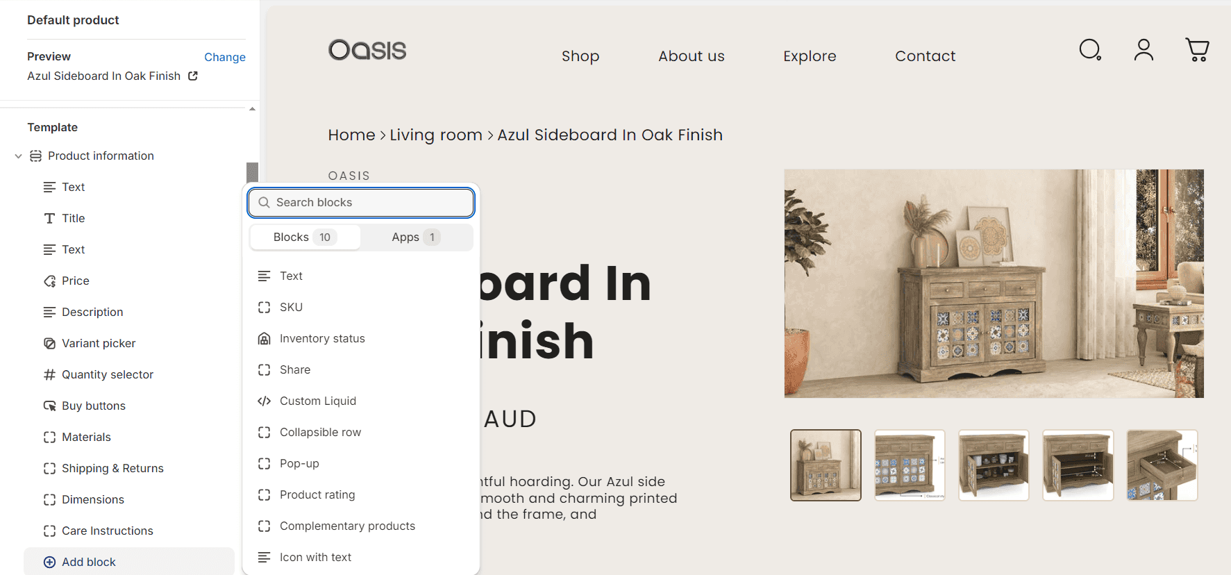
Product information

There are a large range of blocks to choose from that can be used to improve functionality or enhance the appearance of the Product section. The Collapsible row, Custom Liquid, Pop-up, Text and Icon with text blocks can be added as many times as required - all other blocks are limited to one instance each.

Variant picker block The Variant picker block showcases essential product details like color swatches and sizes. Customize it using the settings to choose the Selector style (Dropdown, Pills or Radio)

Related products

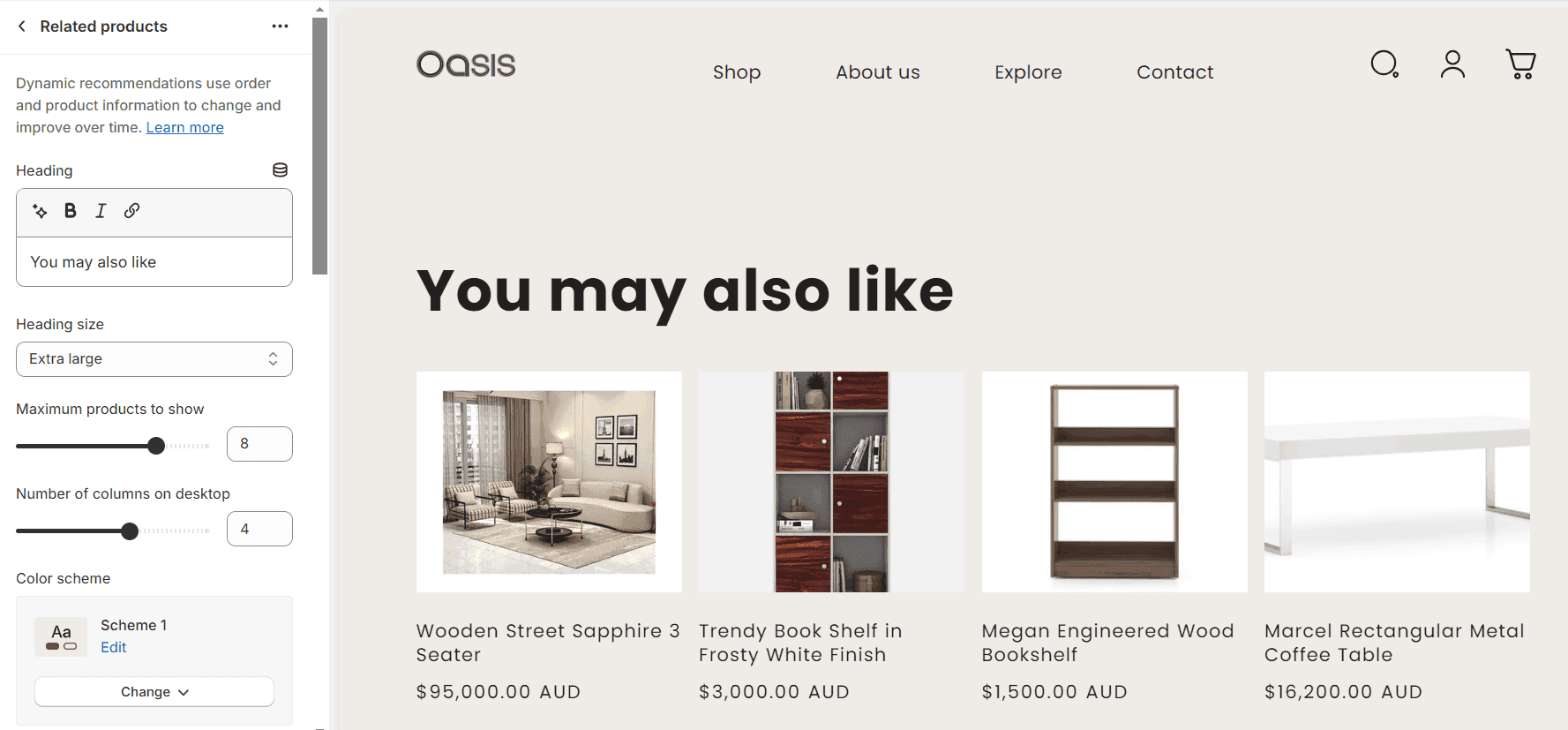
The Related products recommendations use order and product information to change and improve over time

Here you can change the following settings:

Set the Heading. Set the Heading size Select the max products to show Select the number of columns for desktop Set the color scheme for this section Select product card settings

Contact Page

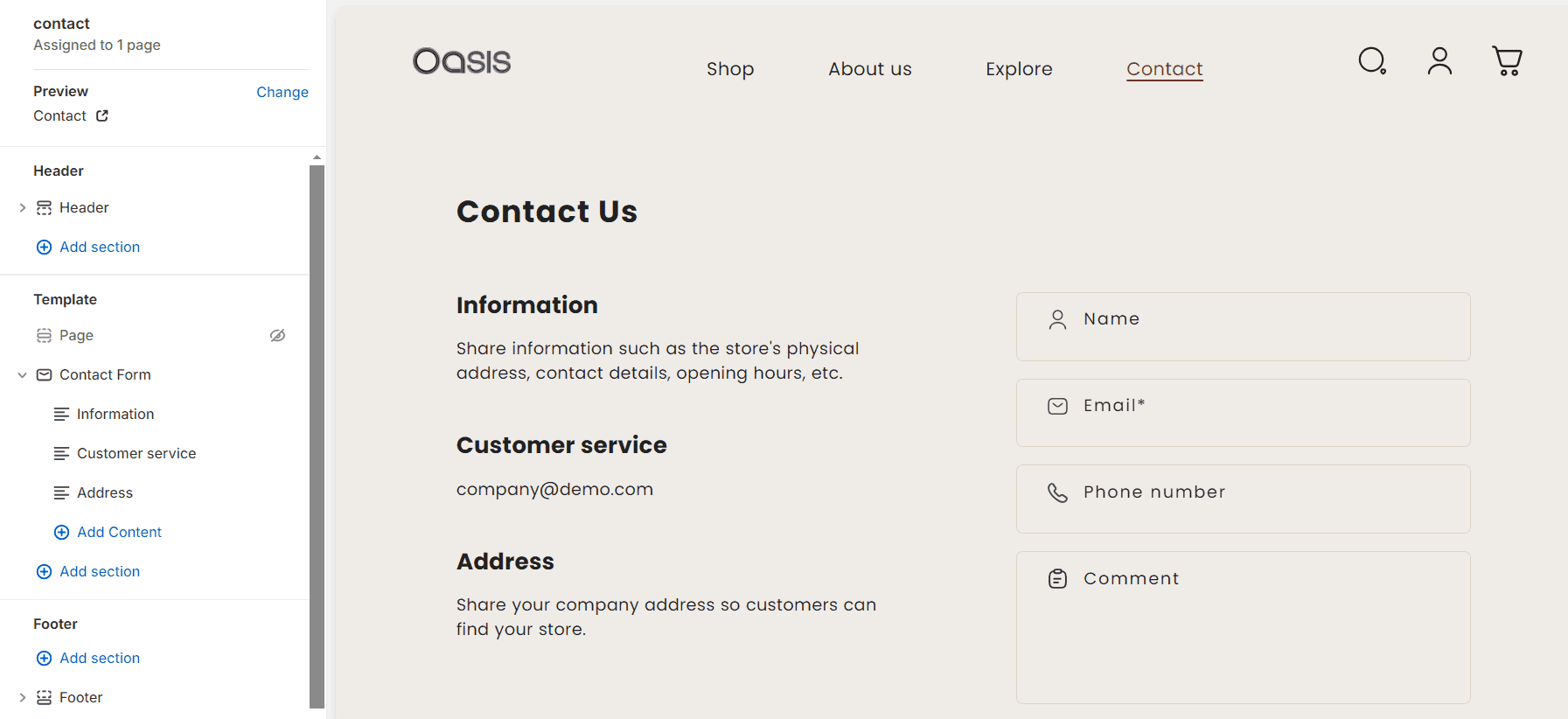
The Oasis theme enables the addition of information block along with the contact form. These blocks can be used to display information like customer customer service details or address

Here you can change the following settings:

  • Set the heading
  • Set the heading size
  • Set the color scheme for the section
  • Set the appropriate padding for the section

Content Block settings:

  • Set Content Title
  • Set Content Description

Sections

Header

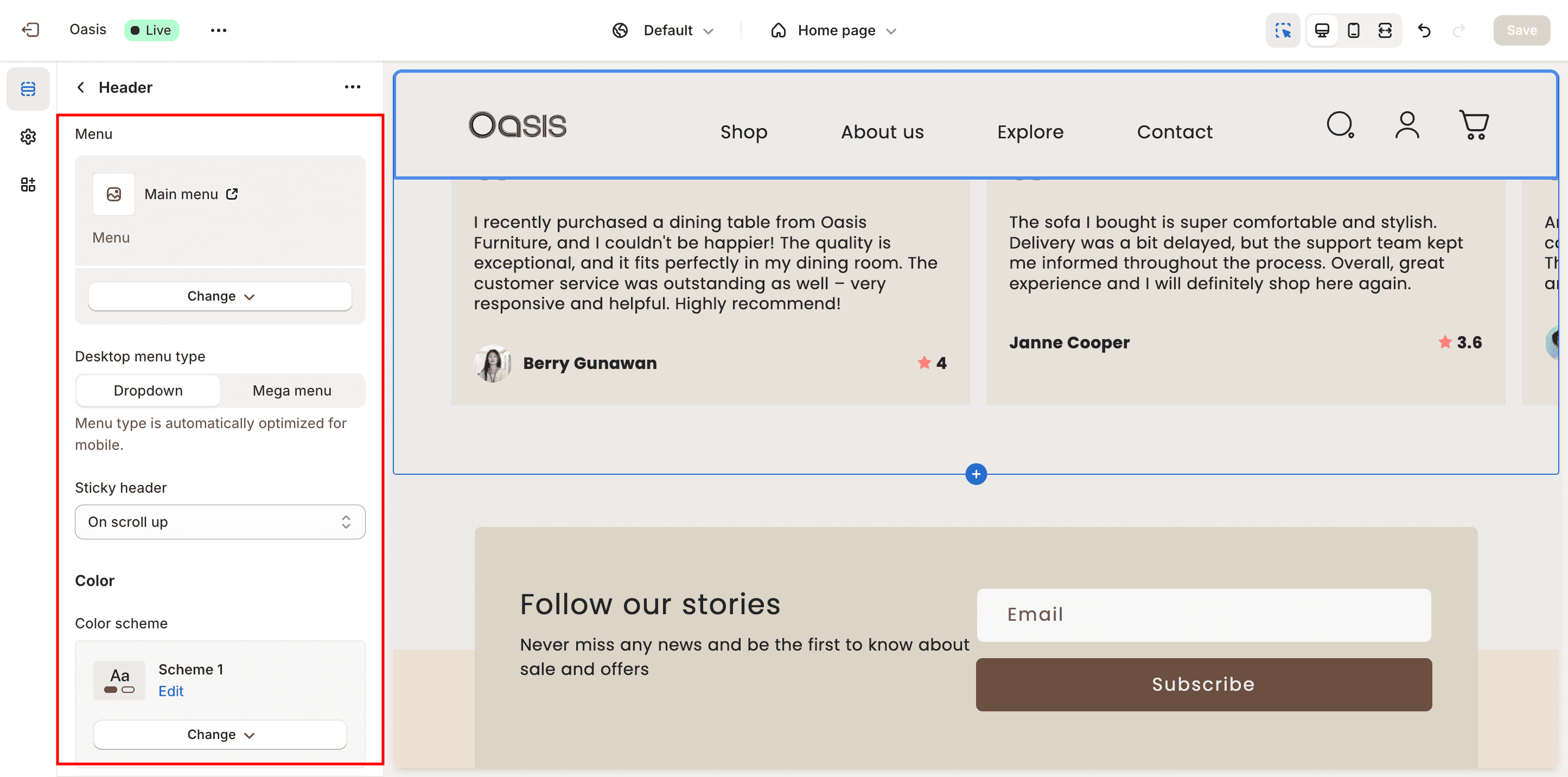
In theme editor, we have header with the following settings:

  • Set the header menu
  • Set the desktop menu type
  • Set the sticky header
  • Set the color scheme of the section
  • Set the menu color scheme
  • Set login avatar to show or not
  • Set the appropriate padding for top and bottom
Header
Herobanner

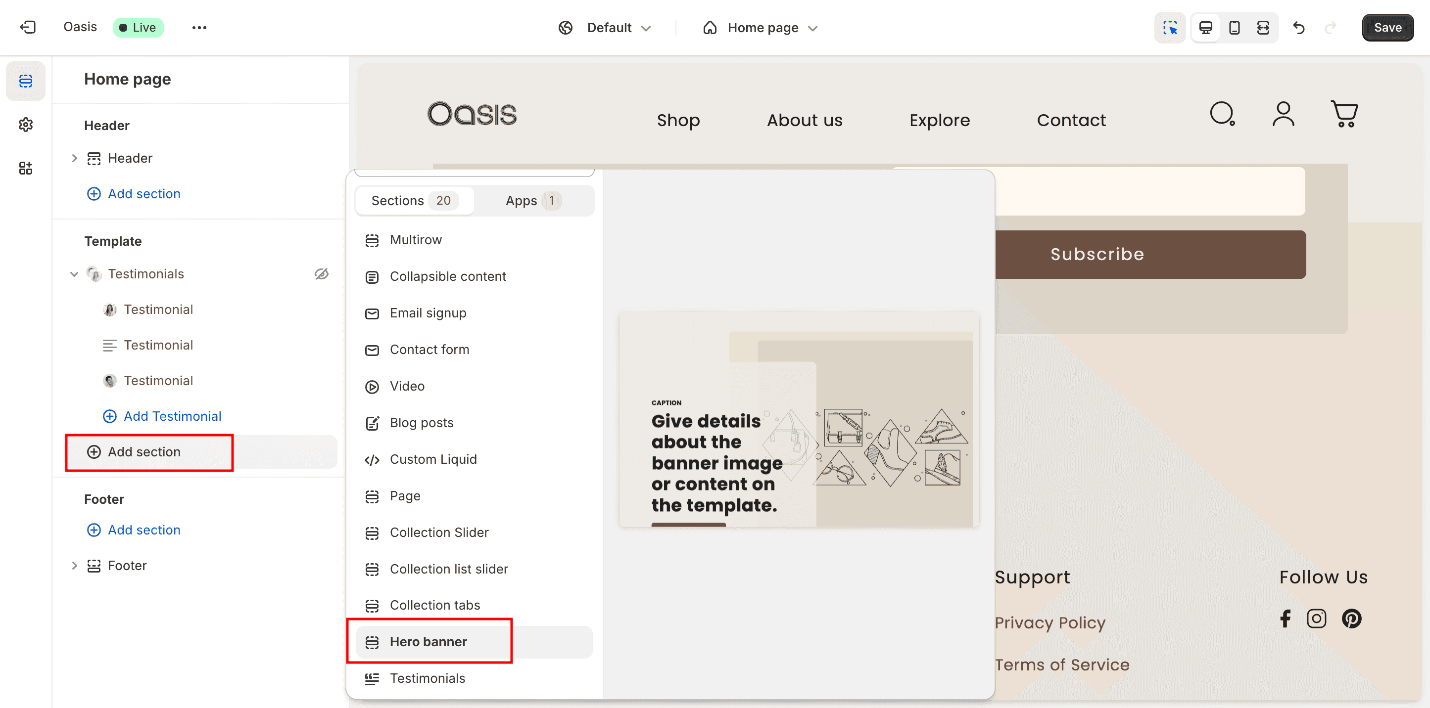
The Oasis theme includes the ** Hero banner** section. Go ** Online store - Homepage** and scroll down to find ADD SECTION button. Once you clicked you will find HEROBANNER in the list.

Herobanner

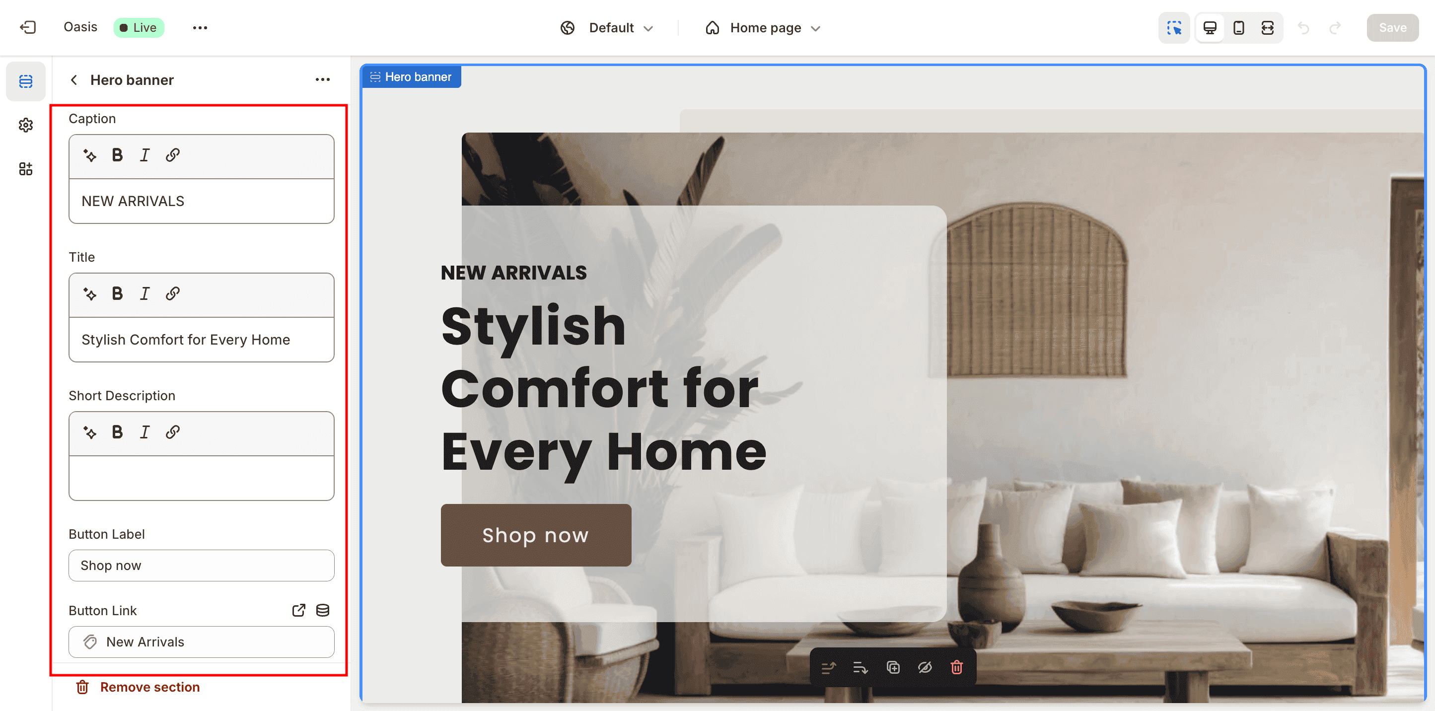
Here you can change the following settings in herobanner:

  • Set the Caption
  • Set the Title
  • Set the short description
  • Set the button label
  • Set the button link
  • Set the appropriate content padding for top and bottom
  • Choose an image to display
  • Set the color scheme for this section Note: The button will not be shown if the Button label is empty
Collection Slider

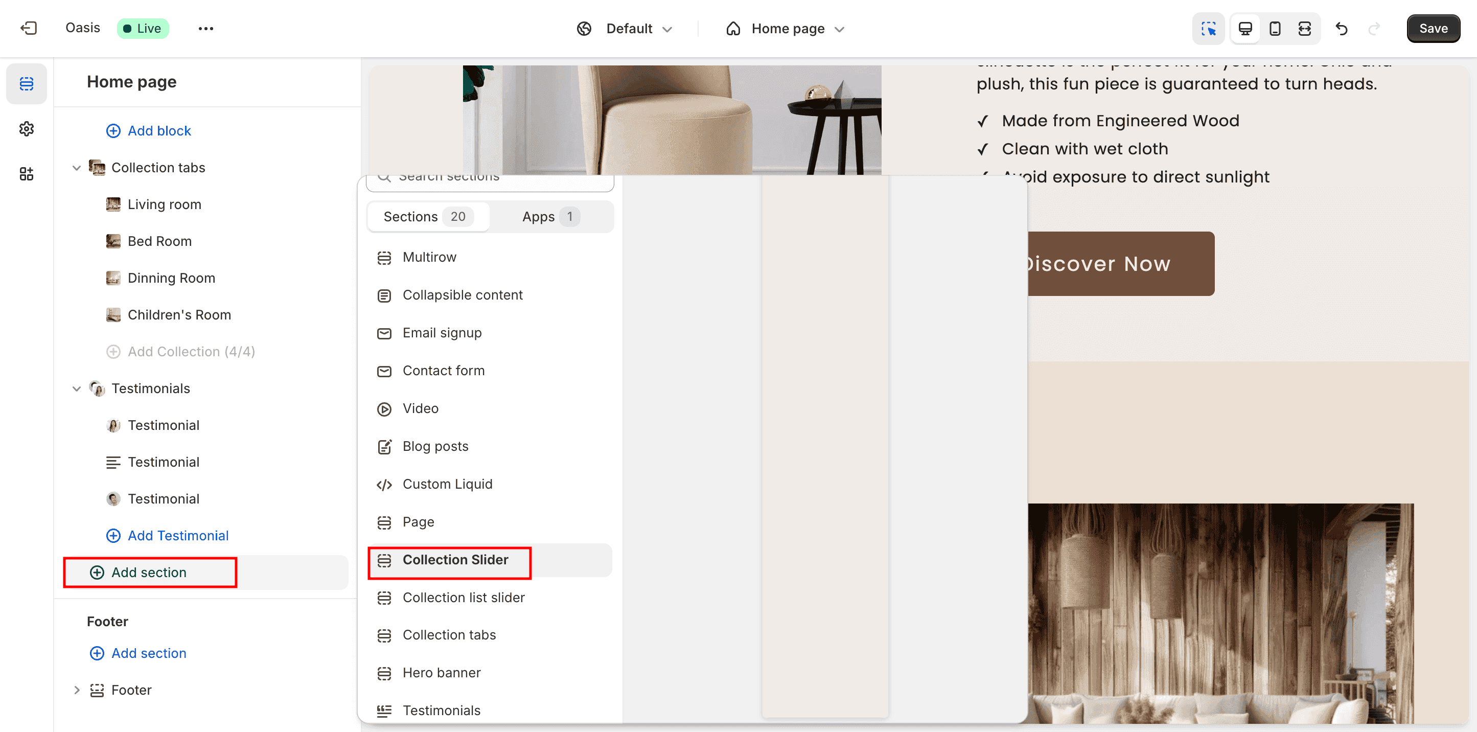
To add a collection slider, click on ADD SECTION and find the COLLECTION SLIDER section in the list.

Collection Slider

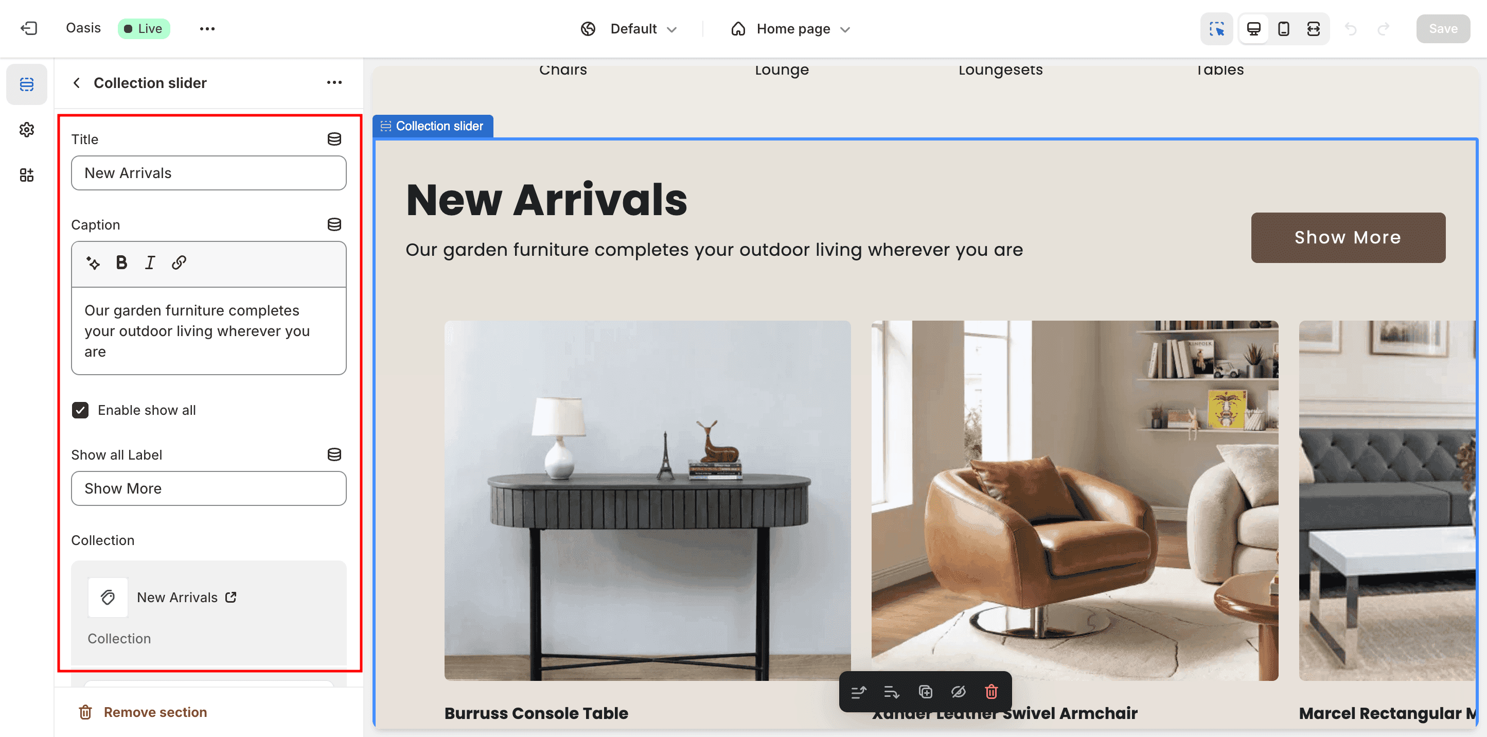
Here you can change the following settings in collection slider:

  • Set the title
  • Set the caption
  • Set the button label
  • Option to enable / disable the button
  • Select the collection what you want to show it in slider
  • Set the appropriate section padding for top and bottom
  • Set the color scheme for this section
Collection List slider

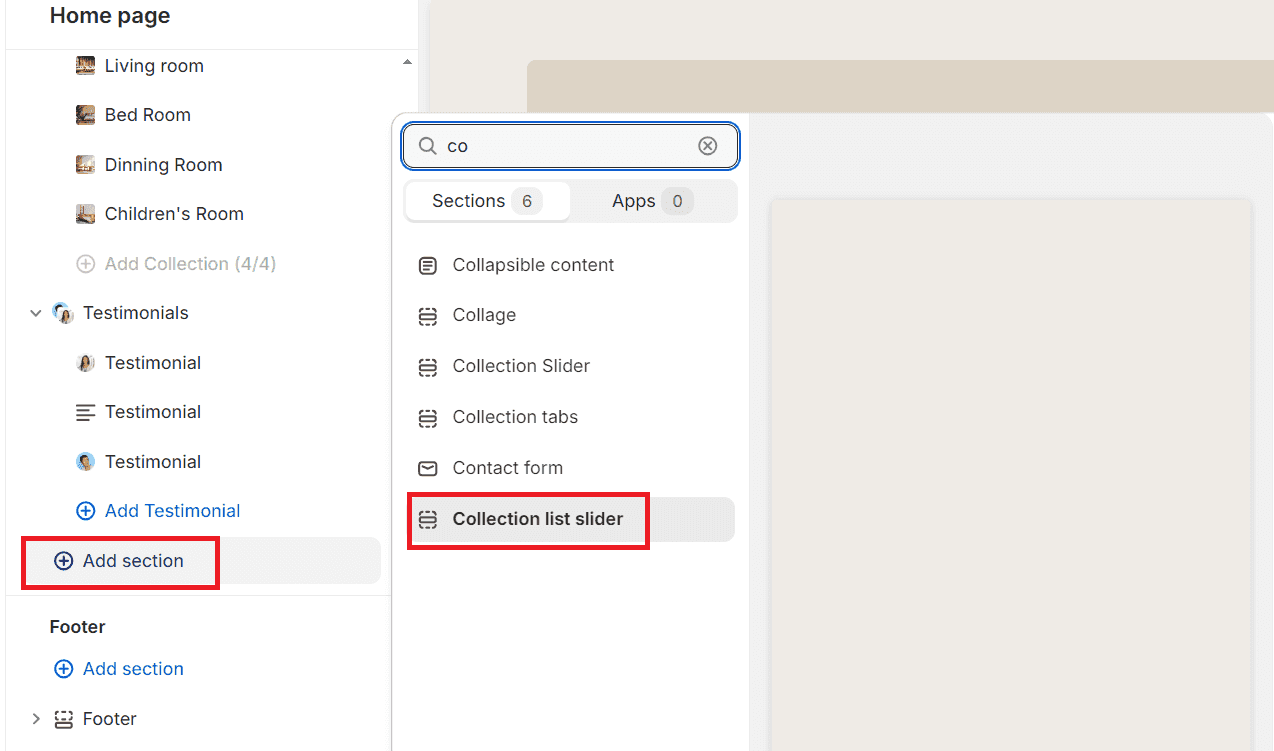
To enable and customize the display of featured collections on the homepage in the Oasis theme, you can follow these steps:

Locate the Add section button and click on it. From the list of available sections, find and select Collection List Slider as given below.

After adding the Collection List Slider section, you'll have customization options and settings available to customize it to your store's style as follows given below.

  • Set the Heading.
  • Checkbox to display the show all Button.
  • Set the Show all label
  • Set the appropriate section padding
  • Set the color scheme for this section
  • Choose the option to select the specific collection that you wish to display. Note: the button will not be shown if the Button label is empty
Collection tabs

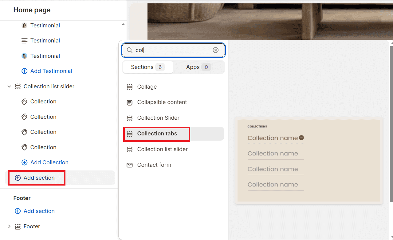
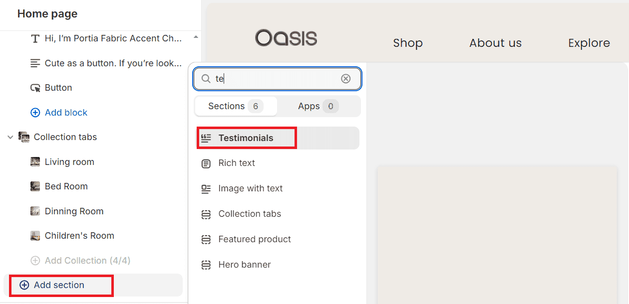
To enable and customize the display of collection tab section on the homepage in the Oasis theme, you can follow these steps:

  • Locate the Add section button and click on it.
  • From the list of available sections, find and select the Collection tabs section as given below.

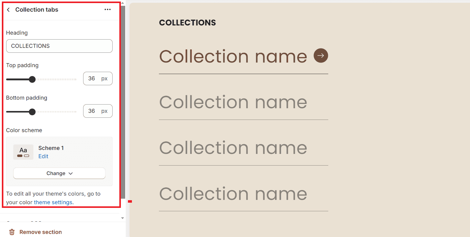
After adding the Collection tabs section, you'll have customization options and settings available to customize it to your store's style as follows given below.

  • Set the Heading.
  • Set the appropriate section padding
  • Set the color scheme for this section
  • Choose the option to select the specific collection that you wish to display.
Testimonials

To enable and customize the display of Testimonials section on the homepage in the Oasis theme, you can follow these steps:

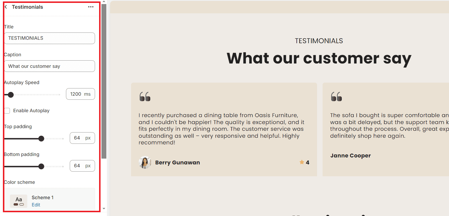
After adding the Testimonial section, you'll have customization options and settings available to customize it to your store's style as follows given below. Here you can change the following settings:

  • Set the Title.
  • Set the caption
  • Set the slider Autoplay speed
  • Choose if Autoplay is enabled
  • Set the appropriate section padding
  • Set the color scheme for this section

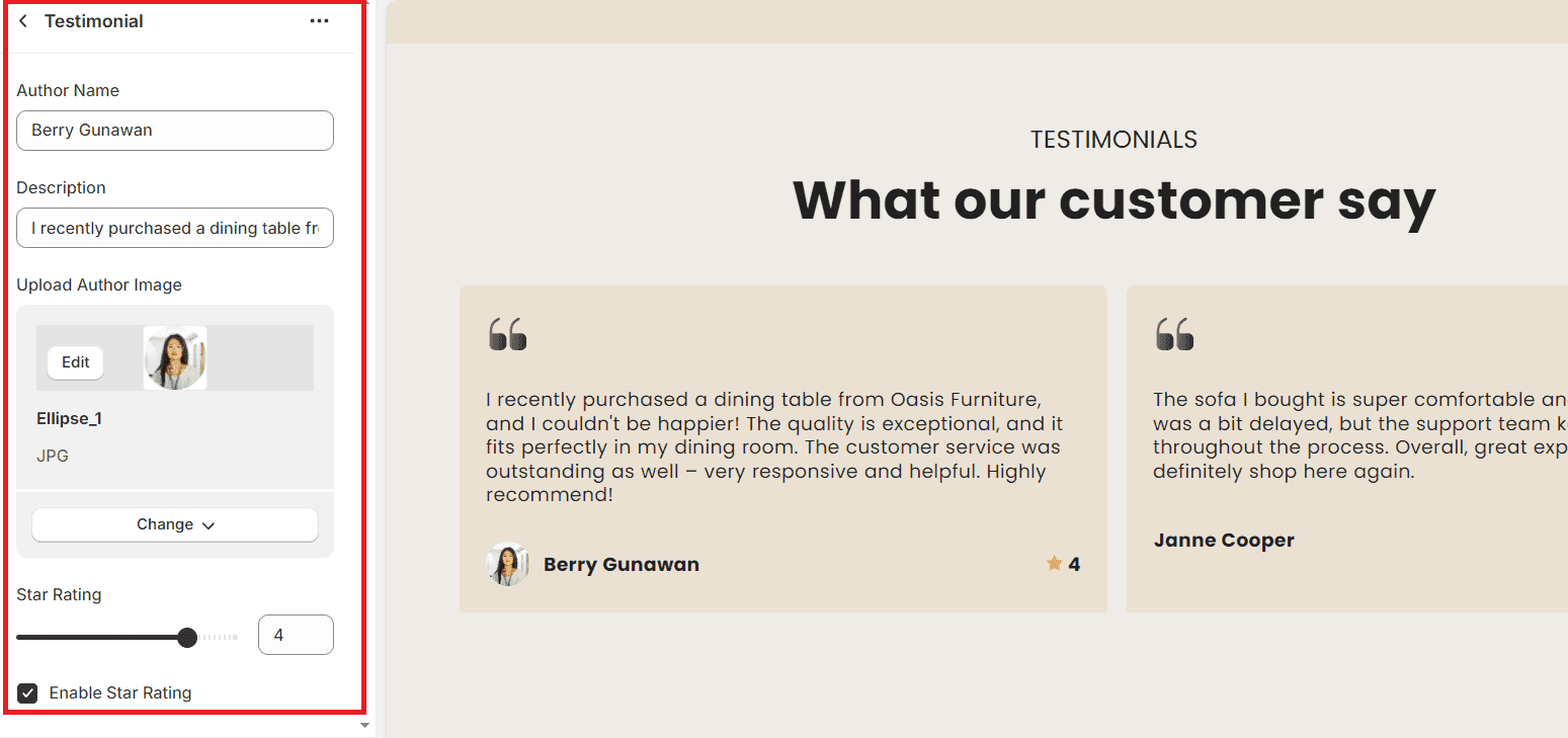
Block Setting :

  • Enter the name of the author.
  • Provide a brief bio of the author.
  • Upload an Image of the author.
  • Specify the star rating score to reflect the author's review or rating.
  • Toggle the option to enable or disable the display of the star rating.
Footer

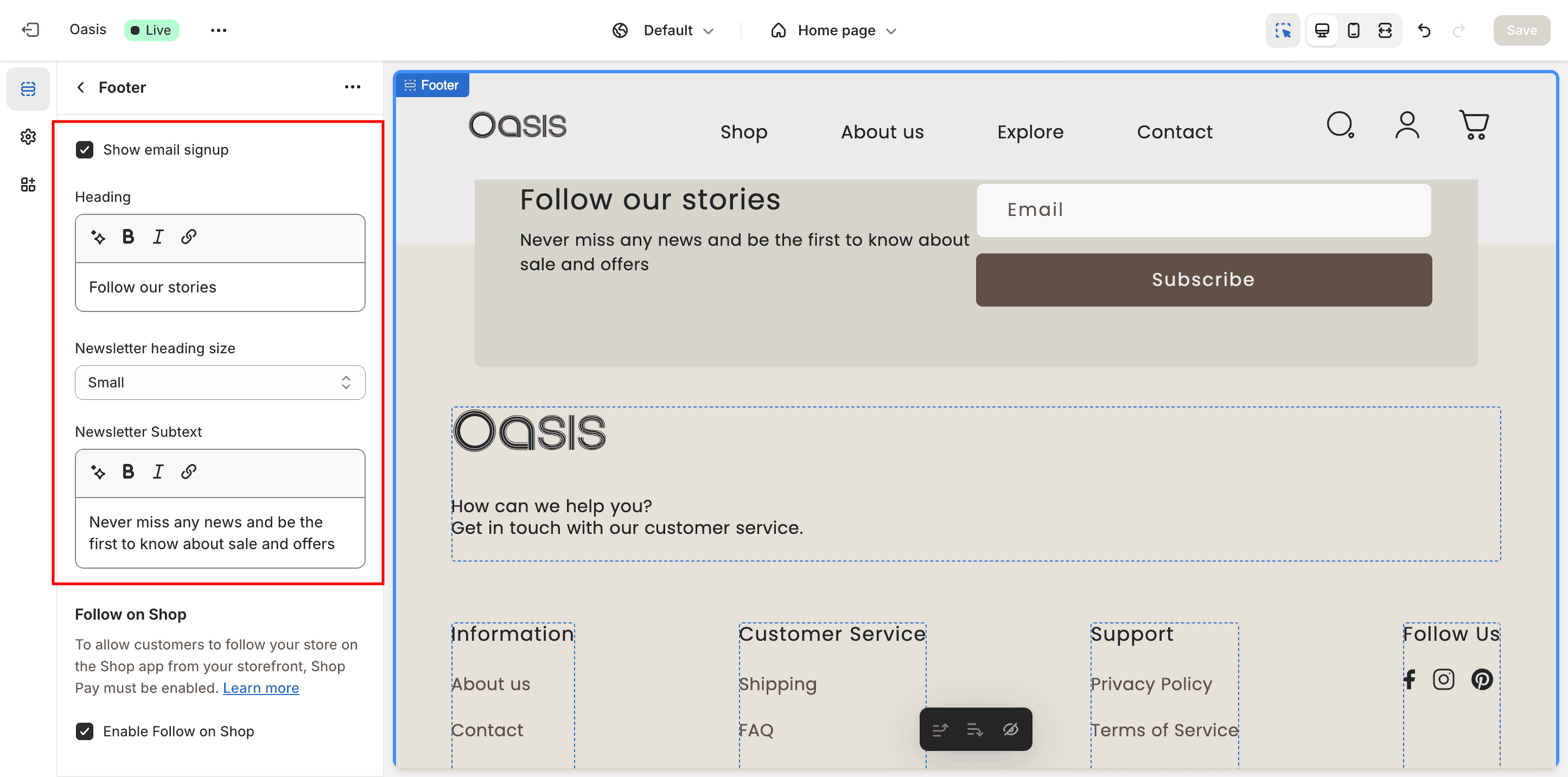
Here you can change the following settings in the footer

  • Enable / disable newsletter
  • Set the newsletter heading
  • Set the newsletter heading size
  • Set the newsletter subtext
  • Set the copyright text

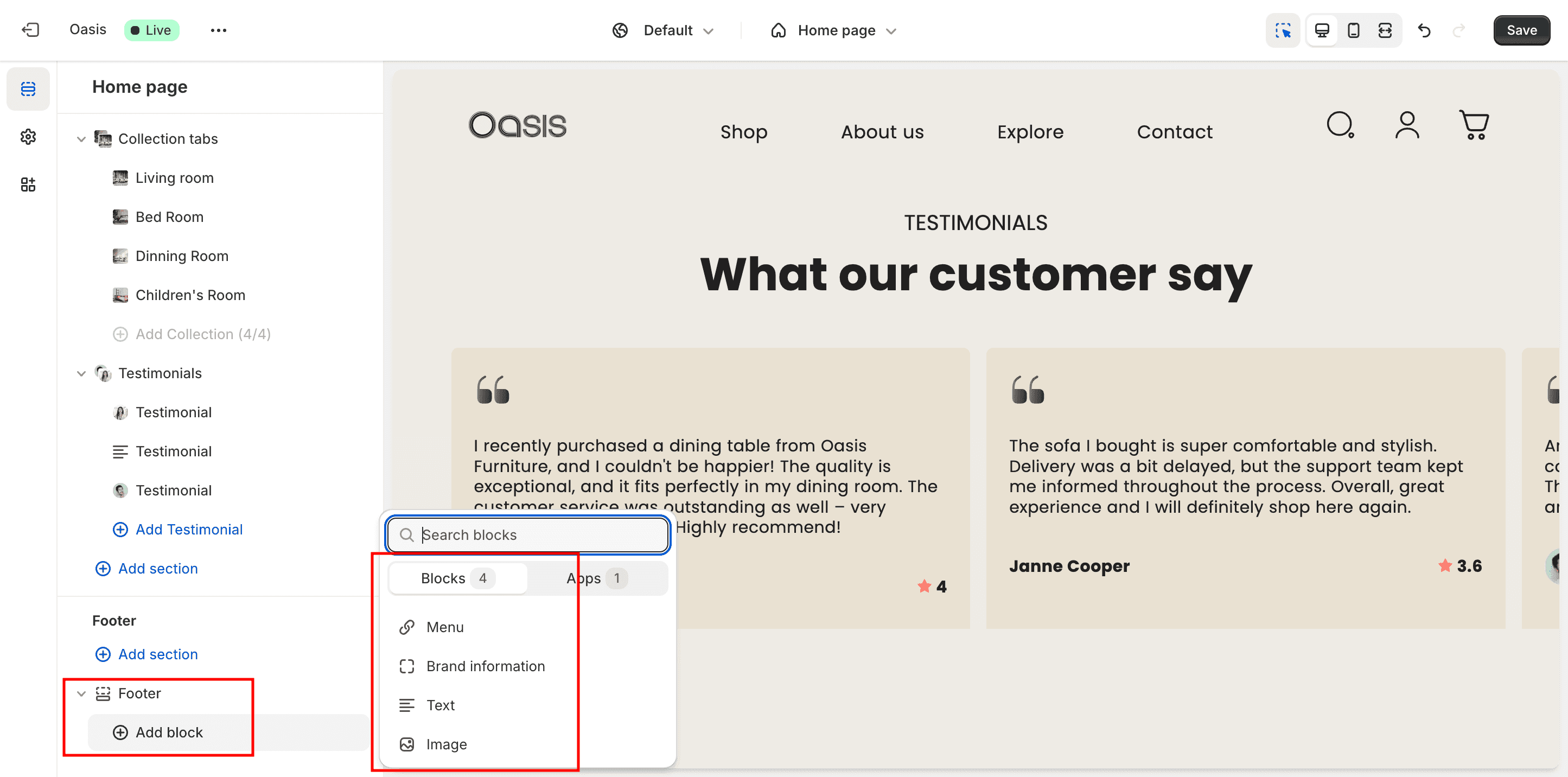
Within the footer section, we have options to add blocks. Click the ADD BLOCK, you will find the blocks list.

Image block:

  • Here you can change the following settings in the image block under footer:
  • Set the image or logo
  • Set the width for the uploaded image
  • Set the alignment for the image
  • Set the description Menu block:
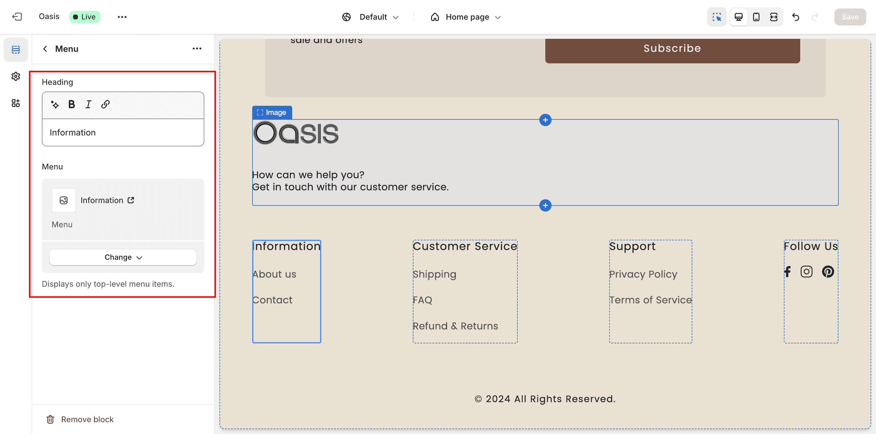
  • Using the menu block, we can use the footer menus what we have created in navigation in a store.
  • Set the heading for the menu list
  • Set the menu list to show in footer

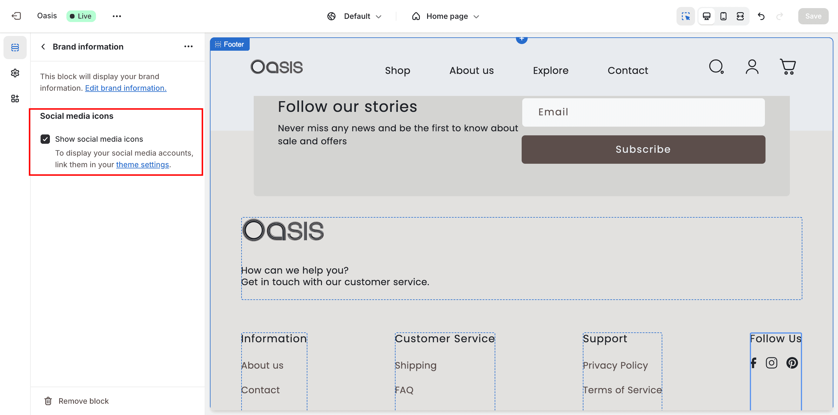
Brand information Block: Under brand information block, we have an option to enable the social media icons in the footer.

Need more assistance? Our expert team is here to help you.

Contact us